





Headstone Fonts a Stone Carver Actually Trusts

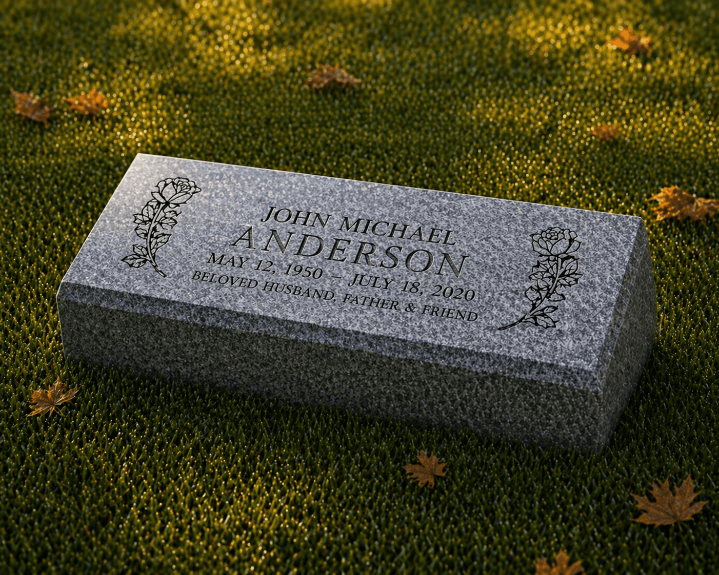
The first thing I do with any new lettering job is run my thumb across a finished stone from last year. Sounds odd, I know. But you learn more about headstone fonts from touch than from any screen. A letter cut into granite is not printed – it’s carved, a small valley with two sloped walls meeting at a point, and the way light falls into that valley decides whether a name reads clearly from ten feet away or disappears into the polish. Our family has been cutting names into granite for three generations, going back to Arslan Hajiev and the little workshop that grew into what Memory Stones is today, and if there’s one lesson that got passed down at the bench it’s this. The font matters more than almost anything else on the stone.
Families usually arrive thinking about shape and color. Upright or flat. Black granite or gray. Then we sit down over the design proof and suddenly the whole conversation is about letters. Which style feels like Dad. Whether Grandma’s name should be in script. Why the cemetery down the road has stones from the 1940s you can still read at a glance while some newer markers have gone blurry. So let me walk you through what we’ve learned, the styles we cut most, and how to pick lettering you’ll still be glad about in forty years.
What a Headstone Font Has to Survive
Paper forgives everything. Granite forgives nothing. A headstone font lives outdoors through Sacramento summers, Tulsa ice storms, Philadelphia sleet, salt air near the coast, lawn mowers, sprinklers, a century of freeze and thaw. Thin, delicate strokes that look elegant on a laptop can crumble at the edges when sandblasted into stone, or simply fill with lichen until the name becomes a shadow.
That’s why monument lettering has its own rules. Strokes need enough width to hold a clean V-cut. Serifs – those little feet on classic letters – actually help in granite because they widen the ends of each stroke and catch light. Letter height matters too. We rarely cut a family name smaller than an inch and a half on an upright, and dates below three quarters of an inch start to fight with the grain of some stones. On a small flat grave marker, where we sometimes have only 12 by 6 inches to work with, choosing a compact but open letterform is half the job.
And the granite itself talks back. Polished black takes fine detail beautifully – the contrast between the frosted cut and the mirror surface does the work. A rock-pitched gray stone wants bolder, deeper letters. We adjust the font, the cut depth, sometimes the whole layout depending on the color a family picks. It’s a conversation between the letter and the stone, honestly, and we’ve been translating it for a long time.
Fonts for Headstones That Never Go Out of Style
Walk any older cemetery in Ohio or Pennsylvania and you’ll see the same handful of letterforms repeating across a hundred years. There’s a reason. These fonts for headstones earned their place by staying readable while everything around them weathered.
Roman lettering comes first. Modified Roman, Condensed Roman, the classic serif family – upright, balanced, dignified. It’s what most people picture when they close their eyes and imagine a gravestone. We cut more Roman variants than everything else combined, and I’ve never once had a family regret it.
Old English, sometimes called blackletter, is the ornate gothic style you see on older German, Irish, and Slavic family monuments. Gorgeous when done right. It needs size and breathing room, so we usually reserve it for a surname across the top of an upright headstone rather than for dates or verses.
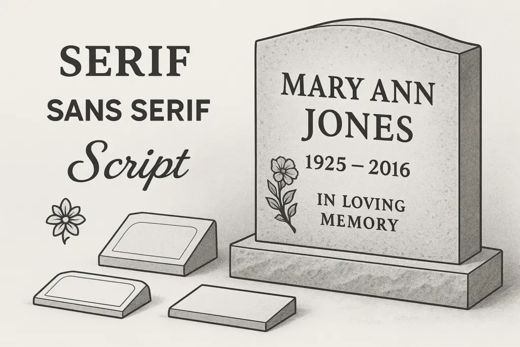
Script styles – flowing, connected, like careful handwriting – carry warmth that block letters can’t. A first name in script above dates in Roman is one of the oldest pairings in the trade, and it still works. The trick is choosing a monument-grade script with thickened strokes. A wispy wedding-invitation script will not survive the sandblaster.
Then the clean modern faces. Block and sans-serif lettering, straightforward and quiet, suits contemporary flat markers and slant markers especially well. Families choosing our modern curved shape headstones often lean this way. And we regularly cut Hebrew, Arabic, Chinese, Vietnamese, Korean, and Cyrillic inscriptions – our Asian style monuments and Quran-engraved designs each come with their own lettering traditions, and we follow them carefully rather than forcing everything into a Western mold.
Best Fonts for Headstones by Granite Color and Finish
Here’s where I’ll be more direct, because “it depends” helps nobody at a hard time. If you ask me for the best fonts for headstones, my answer changes with the stone in front of us.
On polished black granite – our most requested color – almost anything reads well, which is exactly why families sometimes overdo it. My advice is one decorative element, not three. A script first name or an Old English surname, then keep the rest in a steady Roman. Black granite also takes laser etching, so portraits and fine artwork can share the surface with carved lettering without crowding it.
On gray granite, contrast is lower, so go bolder. Deep V-cut Roman or a strong block letter, sometimes with a darkening litho applied inside the cut. Gray is honest and traditional and it photographs beautifully at dusk, but it punishes thin lettering.
On reds, browns, and the rarer colors we bring in – stones with heavy movement in the grain – I steer families toward simpler letterforms. The granite is already doing something visually. Let it. A quiet serif on a dramatic stone often looks more expensive than an elaborate script fighting the pattern underneath.
Finish matters as much as color. Frosted panels give lettering a uniform background on busy granite. Raised letters, where we carve away everything around the name, suit ledger headstones and larger companion monuments. Skin-cut outlines work for verses where space is tight. We’ll show you all of it before anything touches stone.
Matching Fonts for Headstone Types We Make
Every product in our catalog puts different pressure on the lettering, and picking fonts for headstone projects starts with the monument itself.
Flat markers are the exercise in restraint. Starting at $55 in our current sale, they’re the most affordable memorial we make, and the small canvas rewards clean, compact letters – a condensed Roman or a simple block face, name and dates, maybe a small emblem. Bevel markers and slant markers give you a bit more height and a tilted face that catches light differently, so lettering can grow slightly more expressive.
Upright headstones are where lettering becomes architecture. On a classic arch upright – ours run around $2,330 after the current 35% full-payment discount – the surname often spans the top in large letters, first names and dates beneath, a verse below that. Three lettering zones, sometimes three coordinated styles. Companion monuments for husband and wife double the layout puzzle. Two names that must feel equal, a shared surname, often a joined verse across the center. Symmetry in the lettering carries real emotional weight there, and families feel it even when they can’t name why.
Bench headstones, headstones with vases, round-top designs, columbarium plates, shape headstones cut as hearts or custom silhouettes – each has its own logic. A heart-shaped stone, for instance, almost demands a curved script following the shoulder of the design. We’ve cut thousands of these across California, Texas, Florida, New York, Illinois, and beyond, and the pattern library in our heads is deep. Bring us the person; we’ll bring the letterform.
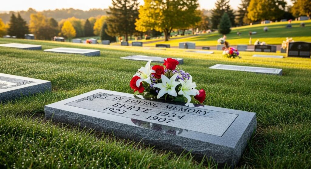
Headstone Font Examples From Recent Orders
Sometimes examples say more than categories, so here are a few headstone font examples from work that’s gone out of our shops lately, details changed for privacy.
A Houston family ordering a double upright for their parents chose Vermarco-style Roman for both names – a font born in the monument industry, wide and steady – with a connected script “Together Forever” arcing between two engraved roses. From the road, the names read first. Up close, the script reveals itself. That layering is the whole art.
In Sacramento, a daughter memorializing her mother, a schoolteacher for 34 years, asked for lettering that looked like chalkboard handwriting. We adapted a monument script, thickened the strokes, tested it in our 3D preview against the Bahama Blue granite she’d chosen, and adjusted twice before she said, quietly, that’s her writing. Two revisions come free with every design, and moments like that are why.
A veteran’s family in Tulsa kept everything in crisp block lettering with a bronze service medallion – military simplicity, deliberate and proud. Veterans receive 35% off with full payment from us, and first responders the same, which came up naturally because his son was a firefighter planning his own pre-need stone on the 36-month interest-free plan. And a Vietnamese family near our Orlando location combined traditional diacritics with a lotus carving on an Asian style upright, the kind of job where font choice and cultural respect are the same decision.
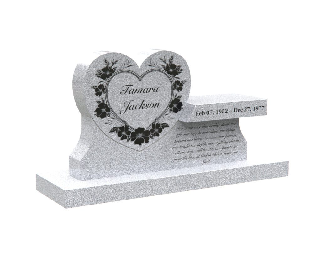
See Your Lettering Before We Ever Cut Stone
This is the part that has changed most since my grandfather’s day. Right on every product page at memorystones.us, you can configure your headstone yourself – type the actual name, choose the font, pick the granite color, add artwork – and watch it render in 3D. Then switch to AR preview and stand the finished monument in your own backyard or, if you’re at the cemetery, on the actual plot. Seeing your mother’s name in three different fonts at true scale settles debates that used to take families weeks.
Nothing goes to production until you approve a proof. Our designers check letter spacing by hand, because software still kerns like software, and a carved “AV” pair needs tighter fitting than a printed one. Cemetery rules get verified too – some grounds restrict raised lettering, some require specific sizes, and we handle that paperwork so you don’t have to learn cemetery bureaucracy while grieving. Lifetime warranty on the craftsmanship, free shipping nationwide, and a 10% price match if a competitor quotes you lower on comparable work. That last one exists because we’re confident, not because we’re worried.
Talk It Through With Someone Local
Fonts are personal, and screens only go so far. If you’d rather trace a letter with your finger before deciding – and plenty of people would – come see cut samples in person. We have showrooms and offices in Sacramento, Los Angeles, Laguna Woods, and Hesperia in California, Houston, Allen, and Dickinson in Texas, Edmond, Tulsa, and Enid in Oklahoma, Lemont and Plainfield outside Chicago, Galloway near Columbus, Essington by Philadelphia, Tukwila in the Seattle area, Roseland in New Jersey, Orlando, and Spartanburg, South Carolina. Families drive in from Kansas, Arkansas, North Carolina, and New York too, and everything can also be handled entirely by phone and email if the distance is too far.
The consultation is free. So is the 3D design. Payment plans run 0% in-house for up to 12 months, extended financing up to 24 months, and pre-need arrangements up to 36 months interest-free, because a name carved right shouldn’t wait on a lump sum. Take your time with the letters. The stone will hold whatever you choose for a very, very long while – which is exactly the point.
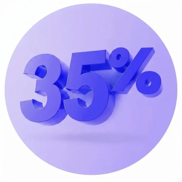
 SUMMER SALE - 35% OFF everything with full payment
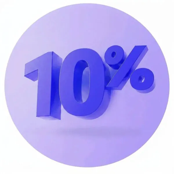
 10% OFF on installment plans
