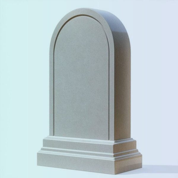
How to Select Fonts and Arrange Text for Headstone Engraving

Designing a headstone is a profound responsibility. It is an act of love, a final tribute, and a permanent historical record of a life lived. While the emotional weight of this task is significant, the practical execution requires a clear understanding of design and masonry. Selecting the right font and arranging the text correctly on a headstone is fundamentally different from designing for print or digital media.
Unlike ink on paper, letters on a headstone are physical voids carved into solid rock. They rely on shadows, light, and contrast to be legible. Furthermore, these inscriptions must withstand decades—often centuries—of wind, rain, snow, and sunlight. A font that looks elegant on a computer screen might turn into an unreadable blur when sandblasted into coarse granite.
This comprehensive guide will navigate you through the technical and aesthetic principles of memorial typography, ensuring the tribute you create remains beautiful, dignified, and legible for generations to come.
1. Why Stone Typography is Fundamentally Different
When choosing a typeface for a monument, aesthetic preference must always be balanced with material reality. The primary goal of a headstone is communication, and several physical factors dictate how well that communication works:
-
The Chipping Factor: Stone is strong, but it is also brittle. If letters are placed too closely together, or if a font features incredibly thin, delicate lines, the stone between the grooves can chip or collapse during the engraving process.
-
The Shadow Effect: Depending on the engraving method, letters are often left unpainted. You read the text because of the shadow cast inside the carved groove. Fonts with varying line weights (thick and thin strokes) catch light differently, which can either enhance or diminish readability depending on the depth of the cut.
-
Weathering and Erosion: Over decades, the crisp edges of carved stone will inevitably soften. A highly detailed, intricate font will lose its definition much faster than a bold, straightforward font.
-
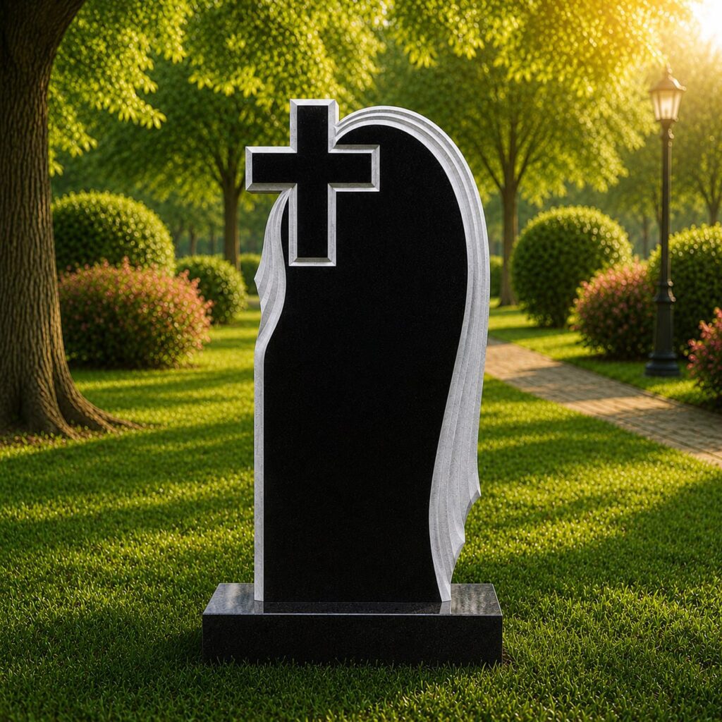
Contrast and Polish: High-contrast stones (like polished absolute black granite) can handle finer fonts because the frosted, engraved letter stands out sharply against the dark mirror finish. Low-contrast stones (like light grey granite or heavily patterned marble) require much thicker, deeply carved fonts to remain visible.
2. Choosing the Right Font Category
Memorial typography generally falls into four main categories. Each carries a different emotional tone and has specific technical requirements for stone carving.
Serif Fonts (The Classic Choice)
Serif fonts feature small decorative strokes (serifs) at the ends of the main vertical and horizontal lines.
-
Tone: Traditional, dignified, timeless, and formal.
-
Practicality: Excellent. The serifs help guide the eye from letter to letter, making them highly readable. The structural variation in line thickness lends itself beautifully to traditional V-cut carving, where shadows pool deep in the stone.
-
Popular Options: Roman Classic, Vermarco, Times New Roman, Georgia.
Sans-Serif Fonts (The Modern Standard)
“Sans” means without. These fonts lack the decorative strokes and maintain a highly uniform line thickness throughout every letter.
-
Tone: Modern, clean, straightforward, and unpretentious.
-
Practicality: Outstanding, especially for small text. Because the line weight is uniform and bold, sans-serif fonts are highly resistant to chipping and remain legible even as the stone weathers. They are heavily recommended for dates, long epitaphs, or heavily patterned stones.
-
Popular Options: Arial, Helvetica, Univers, Optima (a hybrid with slight variation).
Script and Calligraphic Fonts
Script fonts mimic cursive handwriting, calligraphy, or brushwork.
-
Tone: Elegant, personal, romantic, and delicate.
-
Practicality: Poor to moderate. This is where most design mistakes occur. Scripts are notoriously difficult to read from a distance. The loops and thin connecting lines are highly susceptible to chipping during sandblasting and fading over time.
-
Best Practice: Never use a script font for the entire headstone. Reserve it exclusively for the primary name or a short, introductory phrase like “In Loving Memory.” All dates and epitaphs must be in a more readable Serif or Sans-Serif font.
-
Popular Options: Commercial Script, Monotype Corsiva, Brush Script.
Gothic and Old English Fonts
These are highly ornate, dense, medieval-style typefaces.
-
Tone: Deeply religious, historical, imposing, and solemn.
-
Practicality: Low. Gothic fonts require a massive amount of surface area to be readable because the letters are so thick and closely packed. The interior negative spaces of the letters (like the hole in an “e” or “o”) are tiny and often chip away in stone.
-
Best Practice: Use only for short religious headings, family names on large upright monuments, and always at a very large scale.
3. Font Comparison Table
To help you make an informed decision, the table below compares the four primary font categories across crucial memorial design metrics.
| Font Category | Overall Legibility | Weather Resistance | Minimum Size Required | Best Used For | Emotional Tone |
| Serif | High | Excellent | Medium (approx. 1 inch) | Names, Epitaphs, Core Details | Traditional, Dignified |
| Sans-Serif | Very High | Outstanding | Small (approx. 0.75 inch) | Dates, Long Quotes, Poems | Modern, Clean |
| Script | Low | Fair to Poor | Large (approx. 2 inches) | First Names, Short Headings | Elegant, Personal |
| Gothic | Moderate | Fair | Very Large (approx. 3 inches) | Family Surnames, Titles | Historic, Solemn |
4. Principles of Text Arrangement and Composition
Even the most beautiful font will look chaotic if the layout is poor. Composition is about guiding the viewer’s eye logically through the information, creating a sense of balance and peace.
Establishing Information Hierarchy
A headstone should not be read like a book; it should be absorbed visually. You must establish a clear hierarchy of importance through text size and weight.
-
The Primary Focus (The Name): The deceased’s name (or family surname on a companion stone) must be the largest and most prominent element. It is the anchor of the monument.
-
The Secondary Focus (Dates of Life): The birth and death dates should be noticeably smaller than the name—usually about 50% to 60% of the name’s size. They should be clean and instantly readable.
-
The Tertiary Focus (Roles and Epitaphs): Descriptors like “Beloved Mother and Wife” and poetic epitaphs should be the smallest text on the stone. They are meant to be read intimately by someone standing directly in front of the grave, not from twenty feet away.
Alignment and Balance
The way text aligns dictates the overall feel of the memorial.
-
Center Alignment: The traditional and most popular approach. Center alignment creates perfect symmetry, conveying stability, rest, and classical beauty.
-
Flush Left / Flush Right: A modern approach often used on asymmetrical monuments (such as teardrop or wave-shaped stones) or when a large graphic element (like a laser-etched portrait or a carved floral spray) occupies one side of the stone.
-
Justified: Never use justified text (text stretched to create perfectly even left and right margins) on a headstone. It creates unnatural, gaping spaces between words that look terrible carved in stone.

The Importance of “White Space” (Negative Space)
In masonry, the uncarved stone is just as important as the carved letters. Packing a headstone edge-to-edge with text makes it look like a billboard rather than a memorial.
-
Margins: Always leave generous margins around the edges of the stone. Text carved too close to the edge feels cramped and is physically closer to areas where the stone is likely to chip over decades.
-
Tracking (Letter Spacing): In stone engraving, you must add more space between individual letters than you would on paper. This prevents the stone bridge between the letters from breaking.
-
Leading (Line Spacing): Provide distinct visual breaks between different types of information. Leave a noticeable gap between the name and the dates, and another gap before the epitaph begins.
5. The Impact of Material and Engraving Methods
Your font choices must be tailored to the specific stone and the technique the monument maker will use.
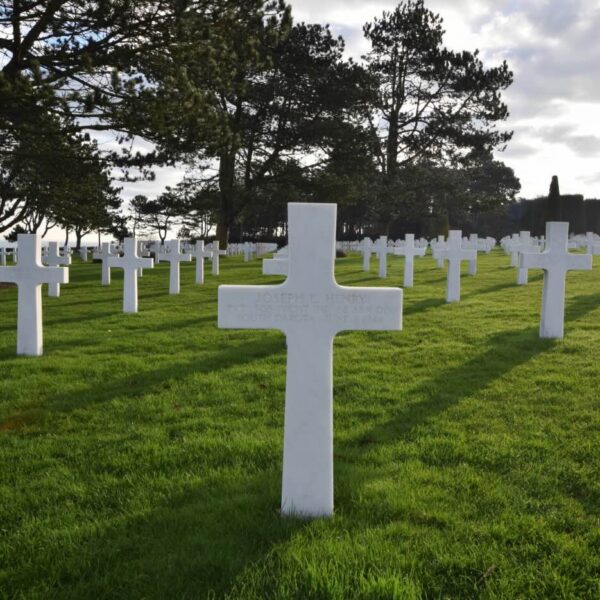
Stone Types and Contrast
-
Solid Black Granite: The optimal canvas. It allows for high-detail laser etching and fine sandblasting. The contrast between the polished black surface and the raw, light-grey carved interior is striking. Almost any font works here.
-
Grey, Pink, or Red Granite: These stones have heavy grain and speckling. Faint or thin fonts will become entirely lost in the natural pattern of the rock. You must use bold, thick Serif or Sans-Serif fonts. Often, the carved letters on these stones are painted with special monument paint (lithichrome) in black or white to make them legible.
-
Marble: A beautifully soft, classical stone that erodes much faster than granite. Intricate scripts and tiny sans-serifs will wash away over the decades. Marble requires deep, traditional V-cut Serif fonts to ensure longevity.
Engraving Techniques
-
Sandblasting: The industry standard. A rubber stencil is applied to the stone, and pressurized abrasive sand carves out the exposed letters. It provides a deep, durable cut. Best suited for bold Serif and Sans-Serif fonts.
-
Laser Etching: A computer-guided laser burns away the top polish of black granite. It allows for photo-realistic portraits and incredibly tiny text, but the cut is very shallow. It is less durable over centuries compared to sandblasting.
-
Hand Carving (V-Cut): An artisan uses a mallet and chisel to carve a deep “V” shape into the stone. This is the most traditional, expensive, and beautiful method. It catches the sun perfectly. It is exclusively suited for classic Serif fonts.
6. Practical Steps for a Flawless Result
Before committing a design to stone—an irreversible process—follow these crucial steps to ensure the final product matches your vision.
-
Request a Scaled Proof: Never approve a design based on a small digital image on your phone. Ask the monument builder for a scaled printout (or a very clear, dimensioned PDF) of the exact layout.
-
Print and Step Back: If possible, print the layout at 100% scale on paper. Tape it to a wall, step back 10 to 15 feet, and see if the name and dates are easily legible. If they blur together, the font is too thin, or the spacing is too tight.
-
Proofread Relentlessly: Spelling errors on headstones are surprisingly common and devastatingly difficult (and expensive) to fix. Have at least three different people verify the spelling of names, the accuracy of dates, and the grammar of the epitaph before signing the final approval.
-
Less is Often More: Resist the urge to fill every inch of the stone with quotes, graphics, and text. A simple, beautifully spaced name and date with a short, heartfelt epitaph often carries much more dignity and impact than a cluttered, difficult-to-read monument.
By understanding the interplay between typography, stone material, and the physical realities of engraving, you can design a headstone that stands as a clear, beautiful, and enduring testament to the person it honors.